|
Contact the seller in advance before paying for the order! Know The Color Theory And Do Magic With ItColor theory is a whole science branch on its own since we are blessed with color vision. And colors play a huge impact on us. We see colors all around us. We have our favorites and dislikes. We pretty much take color for granted, and use it actively or unconsciously to express feelings and emotions. If you want to be seen or noticed, you use strong, radiant colors. If you don't you use muted, dark and even black ones.
Color theory play a huge part in jewelry making. We all know what we like to wear and not, pretty much related to the color combination of the jewelry. You may like silver colored or gold colored jewelry, red glass beads or pastel pearls, big bold colorful earrings or discrete steel on black cord. The shape does of course also play a role in what we desire or dislike, but what first trigger our reaction, are the colors. Therefor color theory may be of great value, so you can create jewelry in beautiful color combinations. Color is magic, but what on earth is it? What do we actually see? What is color?
Reddish colors are long wavelengths When light waves hits an object some waves are absorbed in the object and some are reflected. The reflected light is what we see as a color. So, if you look at an orange, all colors but orange are absorbed by surface of the fruit, and only the orange light reflects back to you. What is reflected from an object depends on its surface and how the light is broken when it hits it. In the color theory, white contains all the colors of the spectrum and reflect them all back at us, blending them so that we see them as white. Black absorb all the colors and non are reflected. The way we see color is also dependent on our eyes perception and how our brain interprets the signals it gets from the eyes. Some people cannot see certain colors like green or blue, and are defined as color blind. This can be caused by defects to the eye itself, the visual nerve or a mild defect in the brains sight center, often genetic. The genetic disorder is on the X-chromosome and that is the reason why there are more color blind men than women. The color wheel: He discovered that when light hit a prism it reflected light in many colors, exactly as we can see them in the rainbow. He named the colors Yellow, orange, red, violet, blue and green, called them a spectrum and placed them on a wheel. Since then there have been many versions of color wheels and color theory. Some based on further developing of Newtons model and some on slightly different aspects based on the development of technology. Today, we operate with three color theory models, each named after their primary colors.
RYB:
RBG: MYC: In color theory there are several terms describing colors, how they are made, where they are placed in the color wheel and how you can alter a color. 
Primary colors: 
Secondary colors:

Tertiary colors: 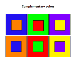
Complementary colors can be used to mute each other into less bright tones. If you mix half and half, they turn into lovely brownish to greyish tones. With polymer clay they are called mud colors or neutrals. You can create a whole specter of new colors by adding various amounts of complementary colors together. The mixing of complementary colors in painting and polymer clay, turn dark and when mixed with more colors it can even be almost black. Pure complementary mixes can be divided into three groups: See complementary colors used in this tutorial 
Analogous colors: Analogous colors are not the best to use if you are making polymer clay canes or patterns where you need contrasts. They work wonderful with beading though, where beads blend from one color to the next in full harmony. They can be given different values to increase contrast, or be kept within the same value. You can also use the complementary colors to change their saturation to make the color scheme more interesting. Analogous color schemes can be made from all the colors within one particular triangle from center to outer surface of the color wheel, giving you more colors within the same analogous range. Hue or Saturation: If you don't want to change the value of the color, but just mute it/make it less bright, you can mix it with a natural that is similar in value, for example gray. 
If you mix contrasting hues in the same value, it will flatten the contrast of the two colors and non of them will stand out. This part of the color theory is of particular importance when you are making polymer clay kaleidoscope canes, mokume gane or other patterns where you want contrast. The ultimate value contrast is black and white. There are 6 hue families.
Achromatic colors: Monochromatic: Polychromatic: 
Color temperature: A way to name the temperature of a color is to name it after the nearest primary color, like blue+red = cool and blue+yellow = warm, orange+yellow = warm and orange+red = cool, and so on. The temperature of a color is also called a hue's bias. 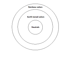
Rainbow colors: Pastel colors: Earth tone colors: Neutrals or Mud colors: Mixing Colors With Polymer Clay Leave a comment ,I would love to hear your opinion on this page. Good or bad, it will help me making this Site better. Comments from other visitorsClick below to see contributions from other visitors to this page... Tutorials & Information Not rated yet |


 If you wonder what a colors complementary color is, you can look at it for about 30 seconds and then look at a white surface. The color you see then is the complementary color. You can try it by looking at the illustration to the left.
 Chromatic colors or Hue contrasts:
 Warm colors advance and cool colors recede. This can actively be used to create illusions of depth. In general you can divide the color wheel in two halves, from yellow green to red violet. The colors ranging from yellow to red to violet are considered warm colors. The colors on the other halves are considered cool colors.
| Find out more about Color and Jewelry making |
 The color book of beaded jewelry The color book of beaded jewelry |
 Polymer Clay Color Inspirations Polymer Clay Color Inspirations |
 Beaded Colorways Beaded Colorways |
 The Beaders Guide To Color The Beaders Guide To Color |
| Need some inspiration? Buy A Magazine |
 Hand crafted Jewelry Hand crafted Jewelry |
 Creative Jewelry Creative Jewelry |
 Beadwork magazine Beadwork magazine |
 Step by step wire jewelry magazine Step by step wire jewelry magazine |
 lapidary Journal magazine lapidary Journal magazine |
 Stringing magazine Stringing magazine |
Promote Your Page Too
